Choosing Interior Wall Paint sounds simple right up until you are staring at fifty whites, three gray-beiges that somehow all look identical, and a label full of words like washable, low-VOC, eggshell, acrylic, scrubbable, and mildew-resistant. Then it gets expensive fast. Paint is one of the few home upgrades that can make a room feel cleaner, brighter, calmer, warmer, more modern, or more expensive in a single weekend. It can also make a room feel flat, cold, chalky, oddly shiny, or impossible to keep clean if you choose the wrong formula or finish.
I’ve seen the same paint mistakes repeat over and over. People pick color from a tiny swatch under bad store lighting, buy a finish that looks stylish but highlights every wall flaw, or spend extra on premium paint without matching that paint to the room’s actual abuse level. Kids’ hallways get delicate matte paint. Dark bedrooms get a cool white that turns blue at night. Kitchens get beautiful flat color that starts showing wipe marks almost immediately. The smarter way to buy paint is not to start with trend color. It is to start with the room, the light, the wall condition, and how the surface will be used when nobody is trying to photograph it.
What makes interior wall paint good in real life
A good wall paint is not just about color payoff. It has to cover well, level nicely, dry with a finish that suits the wall beneath it, and hold up to normal life without becoming a constant touch-up project. The room matters. So does the surface. So does the person living there.
What people usually mean when they say they want “good paint”
In practical terms, most homeowners are looking for some mix of these qualities:
Easy application.
Predictable color once dry.
Strong hide or coverage.
Low odor.
Washability.
Resistance to scuffs and marks.
A finish that looks intentional instead of accidental.
The catch is that no single paint does everything equally well. A dead-flat paint can look velvety and expensive in a formal room, but it may show handprints in a hallway. A more washable satin may clean beautifully, but it can also bounce light in ways that emphasize patching, roller marks, and uneven drywall. Paint performance is always a tradeoff. The smart purchase is the one that makes the right tradeoff for that specific room.
The four things that matter more than brand hype
People often get pulled into marketing language first. I pay attention to four practical things before anything else:
Finish sheen: This changes how light hits the wall, how flaws show, and how easy cleaning becomes.
Coverage quality: Better coverage means fewer coats, but only if the surface was prepped properly.
Durability level: A dining room and a mudroom do not need the same toughness.
Air quality and odor: Low-VOC and low-odor formulas matter more in bedrooms, nurseries, small apartments, and homes where people are sensitive to strong smells.
That alone narrows the choice dramatically. Once those are right, color becomes much easier to choose.
The best way to think about paint
Here is the perspective that saves the most regret: wall paint is not decoration first. It is a surface system. It affects light, mood, maintenance, health comfort, and how finished the architecture feels. Treat it like a surface decision, not just a color decision, and the results improve immediately.
That is also why paint failures are so frustrating. When paint goes wrong, it is on every wall, in every photo, under every lamp, all day long. You cannot ignore it the way you can ignore a bad pillow or a too-trendy vase.
How to choose interior wall paint by room
The room should decide far more than the trend cycle. The same color and finish that feels perfect in one room can be completely wrong in another because the use pattern is different.
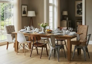
Best interior wall paint for living rooms
Living rooms usually need balance more than extremes. You want enough durability for ordinary life, but not so much sheen that the walls look shiny under evening lamps.
What usually works best:
Matte or washable matte for smoother walls and a softer look.
Eggshell if you want a little more durability.
Warm whites, soft greiges, muted taupes, earthy greens, smoky blues, and gentle clay tones.
What to watch for:
Overly cool neutrals in north-facing rooms.
Flat paint in high-traffic family spaces if people touch the walls a lot.
Satin unless the walls are in very good condition.
If the living room is mostly adult use, a lower-sheen finish can look beautiful. If it is a family room with pets, kids, backpacks, and everyday traffic, step up the durability without jumping straight to noticeable shine.
Best paint for bedrooms
Bedrooms are where color comfort matters most. This is not the room to chase harsh brightness unless that is genuinely your style.
Strong bedroom paint choices usually have:
Low odor.
Soft light absorption.
Calm color behavior in early morning and evening light.
A finish that feels restful rather than reflective.
Best finish options:
Matte or washable matte.
Eggshell if you want a little more resilience.
Best color directions:
Warm white.
Dusty blue.
Muted sage.
Mushroom taupe.
Soft blush beige.
Smoky green-gray.
A bedroom wall paint should still look good when the room is dim. That is a test many trendy colors fail.
Best paint for kitchens
Kitchens ask a lot from paint. Grease, steam, splashes, wipe-downs, chair scuffs, and brighter task lighting make this one of the hardest-working rooms in the house.
Look for:
Washable, durable formula.
Eggshell, satin, or kitchen-specific matte depending on brand and wall condition.
Mildew resistance if ventilation is weak.
Better stain resistance around prep zones.
A kitchen with a beautiful lower-sheen washable paint can look more refined than one coated in old-school shiny satin. But you still need enough resilience to clean it without burnishing the surface.
Best paint for bathrooms
Bathrooms are all about moisture behavior. If airflow is poor, your paint needs to compensate.
Priorities here:
Moisture resistance.
Mildew resistance.
Easy wipeability.
A finish that stands up to steam without feeling plasticky.
Best choices often include:
Bathroom-specific paint formulas.
Satin or soft sheen options in steamy bathrooms.
Higher-performing matte only if the formula is built for humidity.
Powder rooms are easier because they usually do not face heavy steam. Full bathrooms and shower-adjacent spaces need more thought.
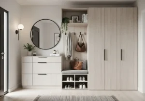
Best paint for hallways, entryways, and stairs
This is where durability becomes non-negotiable. Hallways collect bags, shoulders, fingerprints, pet marks, and mystery scuffs far more than people think.
Best approach:
Washable matte, eggshell, or durable soft sheen.
Mid-tone or slightly forgiving colors if you hate constant wiping.
Better paint, not cheaper paint.
If there is one place I would not cut corners, it is the main traffic path. Cheap paint in a hallway tells on itself quickly.
Best paint for kids’ rooms and playrooms
These rooms need flexibility because the demands change. At first you may care about low odor and soft color. Later you may care more about washability and cover-up ability after the walls become accidental art surfaces.
Look for:
Low-VOC or zero-VOC options.
Strong scrub resistance.
Color that can evolve with the child.
Sheen low enough to look pleasant but durable enough for real life.
I usually prefer a forgiving matte or eggshell in these spaces rather than anything too glossy.
Best paint for home offices
A home office should support focus, but it also needs to look good on screens if you take calls.
Good choices often include:
Soft warm whites.
Muted greens.
Deep blue-grays.
Greige tones.
Soft charcoal if the room gets good natural light.
Finish matters because video calls can exaggerate reflection. A lower-sheen finish often looks better in camera backgrounds.
Interior wall paint finishes explained without the usual confusion
Paint sheen is where many otherwise smart choices go wrong. The finish affects the wall just as much as the color does.
Flat and matte paint
These are often grouped together, but some mattes are more washable than classic flat paint. Both give a low-reflection, softer look.
Best for:
Bedrooms.
Ceilings, when using ceiling paint variants.
Adult living rooms.
Walls with minor surface imperfections.
Pros:
Hides wall flaws well.
Looks calm and modern.
Rich color appearance.
Cons:
Some versions mark easily.
Traditional flat finishes can be hard to clean.
Touch-ups may flash if not done carefully.
If your walls are not perfect, matte is often your friend.
Eggshell paint
Eggshell is the middle-ground favorite for good reason. It has a hint of softness with more durability than flat.
Best for:
Living rooms.
Dining rooms.
Hallways with moderate traffic.
Bedrooms when you want a little more resilience.
Pros:
More washable than matte.
Still relatively forgiving on imperfect walls.
Versatile across many rooms.
Cons:
Some brands read shinier than expected.
Can still show patchiness on rough repairs.
If someone wants one safe whole-house finish for walls, eggshell usually ends up in the conversation.
Satin paint
Satin brings more reflectivity and more cleanability. It can be great where you need toughness, but it is less forgiving visually.
Best for:
Kitchens.
Bathrooms.
Busy hallways.
Trim in some homes, though many use semi-gloss instead.
Pros:
Durable.
Easier to wipe.
Good moisture resistance.
Cons:
Highlights wall flaws.
Roller marks can show more.
Can look a bit too active on large wall expanses if the surface is imperfect.
Satin is useful, but people often overuse it. It is not automatically “better.” It is simply shinier and usually more washable.
Semi-gloss and gloss
These are rarely the best choice for standard interior walls. They have their place, but not everywhere.
Best for:
Trim.
Doors.
Cabinets.
Specialty accents.
Pros:
Very washable.
Durable.
Reflective and crisp.
Cons:
Shows every flaw.
Can feel harsh on walls.
Application errors become obvious.
If you want walls to feel elegant, full-wall gloss is a deliberate design move, not a default setting.
Best finish by room at a glance
Low-VOC, zero-VOC, and healthier interior wall paint choices
A lot of paint discussions still focus only on coverage and color, but air quality matters, especially indoors.
What VOCs actually mean
VOCs are volatile organic compounds, which are chemicals that can be released into the air as paint dries and cures. Many modern paints have reduced VOC content compared with older formulas, which is good news for homeowners.
Why this matters:
Strong paint odor can be unpleasant or irritating.
Some people are far more sensitive to fumes than others.
Bedrooms, nurseries, apartments, and poorly ventilated homes benefit from lower-emission products.
Low-VOC or zero-VOC labels are useful, but they are not the whole picture. Tinting color into the base can sometimes add VOCs back in depending on the product system. That does not mean avoid color. It just means labels are not the only factor.
When healthier paint matters most
I pay closest attention to lower-emission paint when the room is:
A nursery.
A child’s bedroom.
A small home office.
A room with limited airflow.
A primary bedroom.
A space used by someone with asthma or odor sensitivity.
Even in ordinary rooms, lower-odor paint just makes the project easier to live through.
The smarter health question
Instead of asking only “Is this zero-VOC?” ask:
How strong is the odor in real use?
How long does the smell linger?
What ventilation does the room have?
Does the formula cure cleanly?
Is the room occupied quickly after painting?
That is a more useful decision framework than chasing a label without context.
Color selection: how to choose interior wall paint that does not turn weird at home
Color is where emotion and physics collide. Light, undertones, shadow, floor color, furniture, and time of day all change what paint looks like once it hits the wall.
Why paint swatches lie
They do not exactly lie, but they are incomplete. A tiny swatch cannot show how a color behaves across an entire wall, in changing light, against your flooring, next to your trim, and under lamps at night.
That is why smart paint selection always includes sampling on the actual wall. Not one tiny dab. A larger patch, preferably in more than one spot, viewed across at least a full day.
Warm vs cool neutrals
Most paint regrets in “safe” rooms come from undertones.
Warm whites can feel creamy, soft, or slightly yellow depending on light.
Cool whites can feel crisp or stark, and sometimes unexpectedly blue.
Greiges can lean pink, green, or violet.
Taupes can feel rich or muddy.
Grays can turn icy, purple, or flat depending on the room.
A white that looks fresh in a bright showroom can look cold and clinical in a shaded home. A warm beige that seems cozy on a chip can go peachy against the wrong floor.
The undertone test that actually works
Here is the most useful color test I know: compare your paint sample to a true white sheet of paper and to the fixed surfaces in the room. Suddenly undertones appear much more clearly.
You may think a paint is neutral until you put it beside true white and realize it leans green, pink, yellow, or violet. That one comparison can save you from painting an entire room with the wrong “almost neutral.”
Best interior wall paint colors by room mood
If you want the room to feel:
Calm: muted green, warm gray, soft taupe, dusty blue.
Bright but not sterile: creamy white, soft greige, pale mushroom.
Cozy: clay beige, warm taupe, olive-gray, deeper greige.
Airy: soft off-white, gentle blue-gray, pale mineral tones.
Sophisticated: smoky blue, charcoal-green, cocoa taupe, deep warm gray.
The key is not just choosing a beautiful color. It is choosing one that still feels right under your actual lighting conditions.
One unconventional paint-color rule worth following
Choose wall color with your flooring and shadow lines, not just your décor. Furniture can move. Pillows can change. Flooring, trim, built-ins, and hallway shadow zones usually stay.
A paint that flatters the permanent surfaces in the home will feel right longer than one chosen because it matched a throw blanket for six months.
Read Also: Cat Litter Refill Bags: Ultimate Odor Control Solutions for Fresh Homes
Interior wall paint and light: the part people underestimate most
Light does not simply reveal color. It reshapes it.
North-facing rooms
These tend to have cooler, grayer light. Colors can read flatter or colder here.
What usually helps:
Warm whites.
Warmer greiges.
Soft clay or mushroom tones.
Earthy muted greens.
What often struggles:
Stark cool whites.
Thin pale grays.
Colors that depend on warmth to feel alive.
South-facing rooms
These get stronger warm light for much of the day. Colors often look brighter and warmer.
This room can handle:
More balanced neutrals.
Soft whites that might feel too cold elsewhere.
Deeper colors that would overwhelm a darker room.
Just remember that strong light can wash some colors out more than expected.
East-facing rooms
Morning light can be lovely and warm, then turn cooler later.
This is where flexible colors win:
Soft greige.
Muted green-gray.
Warm off-white.
Balanced taupe.
West-facing rooms
West light can get dramatically warm in the afternoon and evening.
These rooms often do well with:
Slightly muted tones.
Colors that can handle warmth without going orange.
Balanced neutrals rather than overt yellow-beige.
Artificial light changes everything at night
Paint chosen only in daylight can become disappointing after sunset.
Warm bulbs deepen cream and beige tones.
Cool bulbs can flatten warmth.
Overhead LED lighting can expose sheen and wall flaws.
Lamps can create pockets of warmth that make undertones stronger.
You should always look at paint at night before committing. A room is lived in around the clock, not just at noon.
Primer, prep, and why good paint still fails on bad walls
Paint gets blamed for problems that actually start with prep. Premium paint over dusty, patched, greasy, or uneven walls will still underperform.
When primer is necessary
Not every repaint needs a separate primer, but many projects still do.
Use primer when:
Painting over raw drywall or fresh patching.
Covering stains.
Switching from dark to light or light to dark.
Painting over glossy surfaces.
Moving between very different finishes.
Dealing with smoke, water, or tannin issues.
Wanting better adhesion on tricky surfaces.
Paint-and-primer-in-one products can be fine for straightforward repaints, but they are not magic replacements for a real stain-blocking or bonding primer.
Wall prep that matters
Before painting:
Clean greasy or dusty walls.
Fill nail holes and imperfections.
Sand patched areas smooth.
Remove flaky paint.
Caulk gaps where needed.
Let surfaces dry fully.
The cleanest final result almost always comes from boring prep done well.
Why patched walls flash through paint
“Flashing” is when repaired spots show differently under the topcoat because the surface absorbs paint differently or has a different texture.
To prevent it:
Prime patches.
Sand repairs well.
Use the right roller nap.
Keep a wet edge while painting.
Do not rely on paint alone to disguise rough repairs.
How to apply interior wall paint for a smoother result
A beautiful paint color can still look amateur if the application is sloppy.
Brush, roller, or sprayer?
For most homeowners, brush and roller are still the most practical combo.
Brush for cutting in and detail.
Roller for main wall surfaces.
Sprayer for certain advanced or empty-space jobs, but it requires more masking, more control, and more cleanup.
A roller with the correct nap for your wall texture matters more than many people realize. Too much nap can leave texture. Too little can struggle on rough walls.
The order that works best
A typical room flow:
Prep and clean.
Patch and sand.
Prime where needed.
Cut in around edges.
Roll the main wall area.
Apply second coat after proper dry time.
Remove tape carefully if used.
Trying to rush recoating is a common mistake. Dry to the touch is not the same as ready for the next coat or fully cured.
How many coats do you really need?
Usually two coats gives the most even finish, especially for color consistency. Some premium paints cover dramatically better than budget lines, but even then, full-room beauty often comes from the second coat.
Single-coat marketing should be treated as a best-case scenario, not a guarantee.
The application mistakes that make walls look cheap
Overworking the roller.
Using low-quality tools.
Painting in poor lighting.
Inconsistent pressure.
Skipping primer where it was needed.
Stretching paint too far.
Painting over dirty walls.
Choosing too much sheen for imperfect surfaces.
Good paint deserves patience for about one weekend. After that, it rewards you for years.
Durability, washability, and what “scrubbable” really means
This is another area where label language can be slippery.
Washable vs scrub-resistant
A washable paint can usually handle light cleaning. A scrub-resistant paint is better built to tolerate repeated wiping without losing finish as quickly.
That difference matters in:
Hallways.
Kids’ rooms.
Kitchens.
Stairwells.
Mudrooms.
If you know the wall will get touched often, prioritize the stronger finish and formula from the start.
When darker colors need better paint
Deep colors can look luxurious, but they can also show scuffs, streaks, and uneven sheen more easily.
If you are using darker wall colors:
Buy the better formula.
Make prep extra careful.
Expect two solid coats, often more.
Keep your technique consistent.
Dark paint is less forgiving, but when done well it can completely elevate a room.
Touch-up reality
Some paints touch up beautifully. Others do not, especially lower sheens with burnishing or darker colors with uneven wear.
If you know you will need touch-ups:
Save the exact paint can.
Label room, wall, and date.
Store properly.
Use the same applicator type when possible.
Remember that full-wall repainting may still look better than patchy spot fixes in strong light.
Budget vs premium interior wall paint: where it is worth spending more
Not every room needs the most expensive formula on the shelf. But not every room should get the cheap one either.
Where budget paint can be acceptable
Budget or mid-budget paint can be fine for:
Low-traffic guest rooms.
Temporary refreshes.
Closets.
Low-stakes secondary spaces.
Even then, prep still matters.
Where premium paint often pays for itself
Spend more in:
High-traffic hallways.
Kitchens.
Bathrooms.
Main living spaces.
Dark-color projects.
Rooms with difficult lighting.
Homes where you care about lower odor and better flow.
Premium paint often earns its keep through better coverage, nicer leveling, stronger durability, and a more refined final look.
A smarter paint budget strategy
Do not spread the same grade of paint evenly across every room. Upgrade where the room is demanding. Go simpler where the room is forgiving.
That targeted approach usually delivers a better house-wide result than buying one middle-grade formula for everything.
Common interior wall paint mistakes that create regret
Some paint mistakes are easy to spot. Others only reveal themselves after the room is back together.
Mistake 1: Choosing color from a chip alone
This is probably the biggest one. Paint must be sampled on the wall.
Mistake 2: Using the wrong sheen for the wall condition
Shinier is not automatically better. It is simply more reflective.
Mistake 3: Ignoring fixed finishes in the room
Countertops, flooring, tile, trim, stone, and cabinetry all affect color perception.
Mistake 4: Painting in a rush before proper prep
Prep is where quality starts.
Mistake 5: Picking a trendy color with no relationship to the home
A beautiful color can still feel wrong if it fights the architecture or adjacent rooms.
Mistake 6: Buying cheap tools for expensive paint
A poor roller and weak brush can sabotage a great formula.
Mistake 7: Forgetting that paint changes with time of day
Daylight, lamp light, and shadow all matter.
The smartest way to choose interior wall paint without overthinking forever
If you want a process that works without turning paint shopping into a month-long identity crisis, use this order:
Decide how the room is used.
Choose the durability level you need.
Select the finish that suits the wall condition.
Narrow color family based on light and fixed surfaces.
Sample large swatches on the real wall.
View them morning, afternoon, and night.
Prep properly.
Buy good enough tools to match the paint.
That order matters. When people choose color first and everything else later, they often end up forcing the wrong finish or formula onto a room that needed something different.
Here is my blunt verdict. The best Interior Wall Paint is rarely the most hyped color or the most expensive can. It is the paint that suits the room’s traffic, flatters the light already in the space, hides or handles the wall condition intelligently, and stays attractive after the furniture goes back in and daily life starts touching it. If you are unsure, lean toward a high-quality washable matte or eggshell in a balanced warm neutral, sample it properly, and let the room prove the answer before you commit. That is how you get walls that still feel right after the smell is gone and the trend mood has passed.